
Persona 01Fran
Mid-career professional pivoting into UX. She knows her material, then freezes explaining her decisions out loud, especially in portfolio reviews. She needs reps at actually saying it, not more reading.

People read, watch, and quiz their way through learning, but never actually say it out loud, so the understanding stays shallow until it’s tested for real. Discourser.AI is a voice-first practice space, built and proven first in UX interview practice as a narrow, honest test case. The prototype proved people understand the idea and light up using it; whether it actually builds real spoken confidence is the open question pushing the next build, a live voice pipeline.
We don’t really know something until we can say it out loud, clearly, to another person.
Most tools let you read or watch, but they never make you actually say it, so the understanding stays shallow.
Discourser.AI is built around that gap, a space to speak your understanding out loud and get real feedback on it.
Mid-career professional pivoting into UX. She knows her material, then freezes explaining her decisions out loud, especially in portfolio reviews. She needs reps at actually saying it, not more reading.

Already working, stacking new skills. He explains fine one-on-one, then chokes under real pressure: stakeholder meetings, high-stakes technical explanations.
Fran and Pablo represent the same core gap from two directions: one is finding the words, the other is finding the nerve. Discourser exists to build both through actual spoken practice, not passive prep.
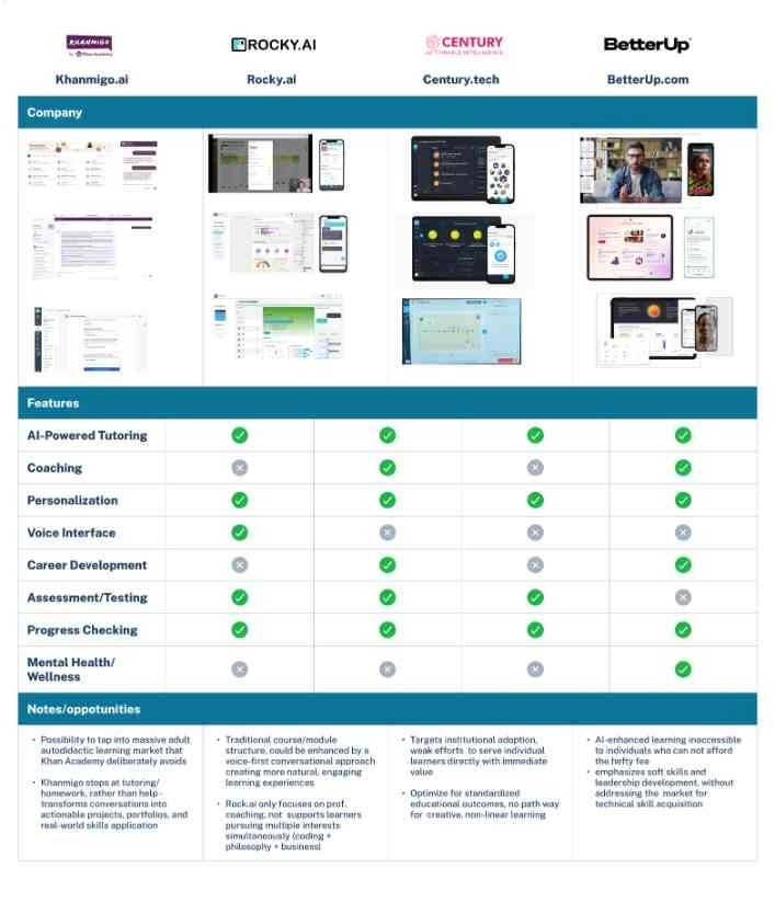
The comparative analysis put four products side by side: Khanmigo.ai, Rocky.ai, Century.tech, and BetterUp.com, scored across AI-powered tutoring, coaching, personalization, voice interface, career development, assessment, progress tracking, and mental health support.
The pattern was consistent. Learning platforms stay academic. Coaching apps change behavior but not technical skill. And no product in the set could validate real-world competency. The SWOT synthesis landed on the opening this product walks through: AI supports teaching but lacks skill validation and confidence building.
The primary research was six semi-structured interviews, 20 to 30 minutes each, run against a written plan: one research goal, five objectives, primary and secondary questions, interviews as the lead method with surveys behind them. Thematic analysis and affinity mapping turned thirty sticky-note quotes into five themes. Each colour below is one participant.
“I feel like I've succeeded when I can use what I learned, not just get a badge.”Participant, pink
“I know I've learned something when I can explain it to my students without notes.”Participant, green
“Fluency and confidence are the real test of mastery.”Participant, pink
“I usually give up when I don't have accountability and no one is checking in.”Participant, blue
“I need accountability, like deadlines or a mentor, or else I'll forget about the course.”Participant, peach
“I'm a sequential learner — I need step-by-step order”Participant, green
“I get frustrated when courses lock modules; I want to look ahead and see what's coming..”Participant, peach
“I need checklists and written steps or else I feel lost : ADHD makes it hard otherwise”Participant, blue
“I like to triangulate information; reading, modeling, trying it out.”Participant, pink
“AI helps me turn my notes into podcasts I can listen back to.”Participant, pink
“I'm a visual learner, but I have to try things hands-on to really get them.”Participant, peach
“I give up when the effort feels heavier than the outcome.”Participant, pink
“I gave up on guitar because life got too busy and the stakes were low.”Participant, peach
“I drop courses if they're too long or too dry.”Participant, green
Frontend developer. Prefers reading to video, abandoned Vue when the job that required it disappeared, uses AI to generate practice quizzes.
Student. Triangulates information across formats, turns his notes into AI-generated podcasts, wants to learn the rules in order to break them.
ADHD learner building an Instagram blog. Needs visual progress tracking, body doubling, and mentor check-ins to keep going.
Math teacher learning digital marketing at Long Beach State. Sequential, tactile learner who uses AI for Socratic questioning.
ADHD learner in a rural area taking UX foundations. Needs structured curriculum, checklists and paper notes, values group accountability.
Product manager re-learning coding with AI tools. Measures success by solving real problems and seeing people adopt the solution.
Two ideas shaped the early interface: presets instead of sliders for configuring a scenario, and two entry paths into practice, a quick start and a configure-it-yourself route. Neither was usability-tested in this phase. They are design hypotheses the prototype leans on, stated here as exactly that, and they are first in line for the next round of testing.
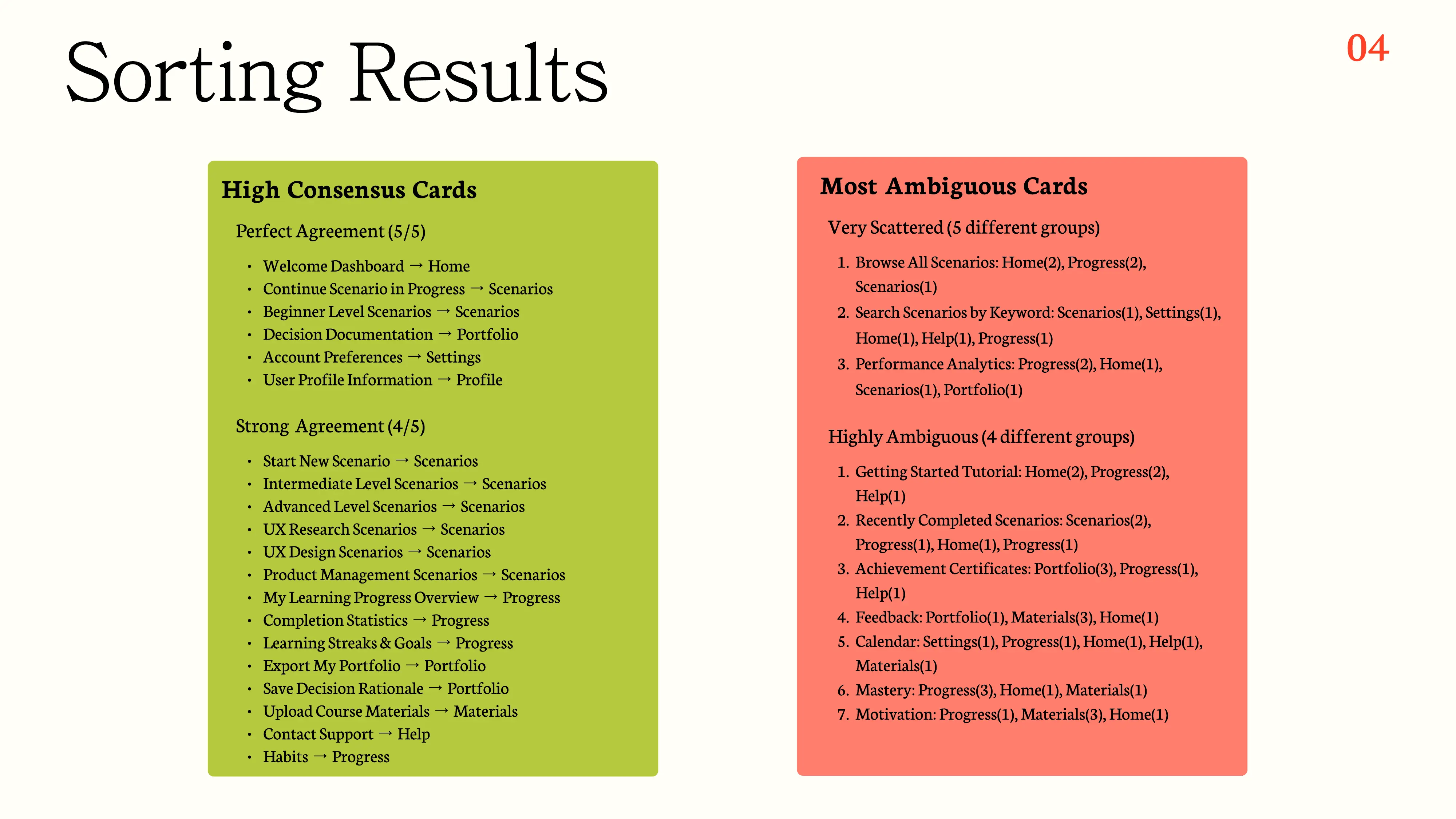
Five participants sorted 38 feature cards into 8 proposed categories on individual FigJam boards. The core held: scenario actions, account features, and portfolio actions landed with strong to perfect agreement. The edges didn’t: Browse All Scenarios, Search Scenarios, and Calendar scattered across four or five different groups.
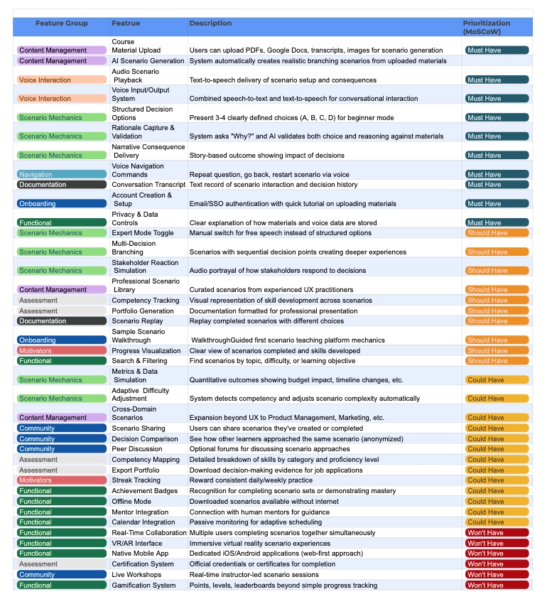
Around forty candidate features went through Must, Should, Could, and Won’t Have. The must-haves are the voice loop itself: course material upload, AI scenario generation, voice input and output, and capturing the learner’s rationale so the AI can validate the reasoning, not just the choice.
The product started as one vague concept: a tool to help learners adjust how they learn. At the how-might-we stage it split into two directions, and both went to a group critique as storyboards. The research phase ran under the name FluentPath; the concept that survived became Discourser.AI.
A conversational decision-practice simulator. Branching storylines evolve on the learner’s choices, with real-world constraints built in: budget limits, timeline pressure, conflicting stakeholder needs.
For self-directed learners who don’t trust certificates and badges. It gives them a safe failure space, where mistakes have consequences but not career-ending ones, and builds confidence through experience instead of review.
An AI tool for optimizing learning strategy: calendar and energy-aware accountability, daily check-ins, and gentle escalation from light nudges to structured support when engagement slips.
Reasonable on paper, but the group couldn’t connect its cognitive mechanics to the thing every interviewee actually wanted, confidence in what they had learned.
“Everyone immediately got the Impact Sim, but thought the Adaptive Ally was a bit foggy.”Group critique debrief, September 2025
The build also started mobile-first and switched to desktop-first. Group critique confirmed what the wireframes were already showing: the core activity, a video conversation with realistic interlocutor presence plus post-conversation analysis, needs multiple content panes visible at once. Desktop supports that. Mobile doesn’t, and it stalled progress trying.
These are the working artifacts, shown as static views for now. An interactive version of the prototype is coming; nothing here is embedded from Figma.
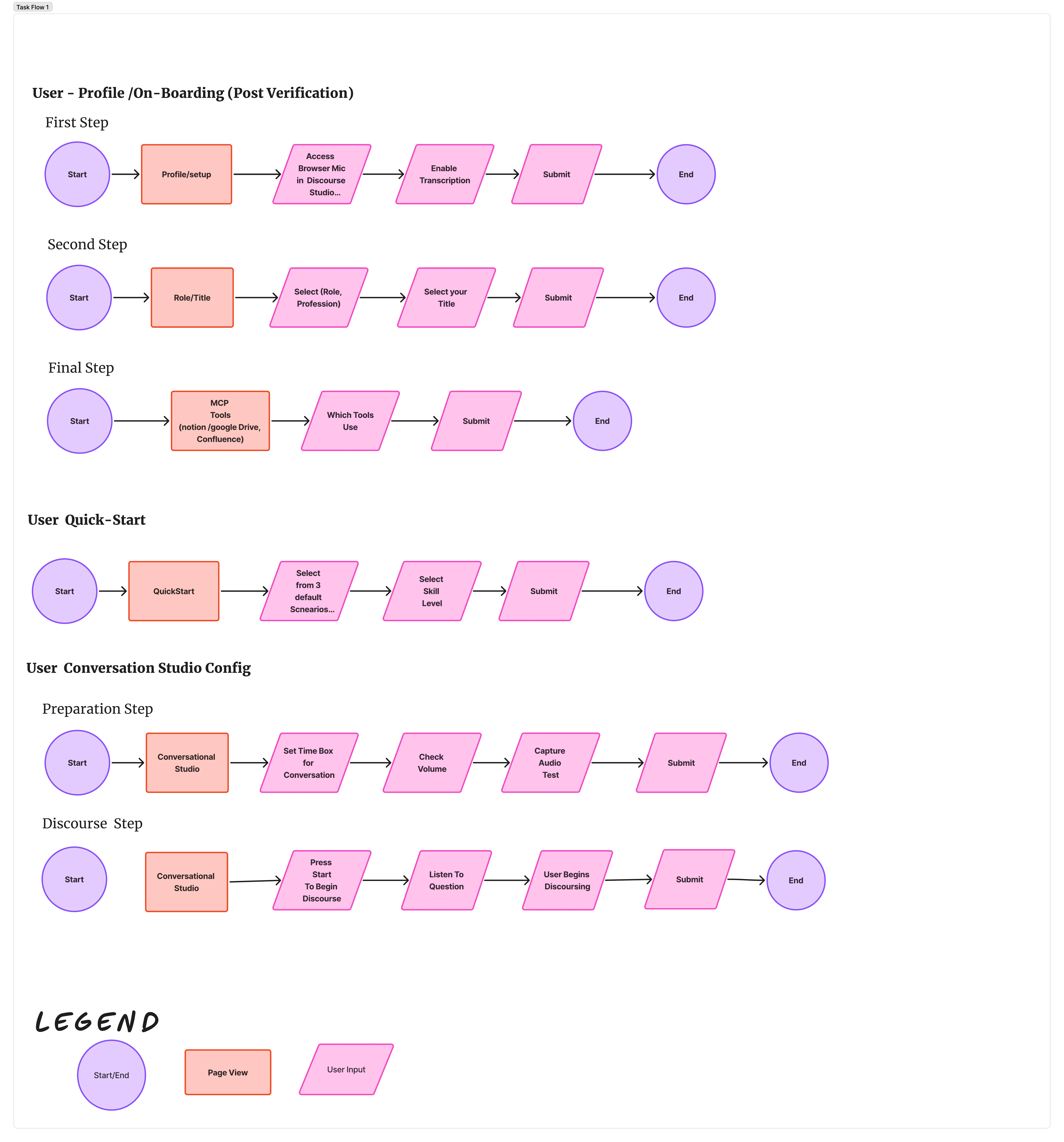
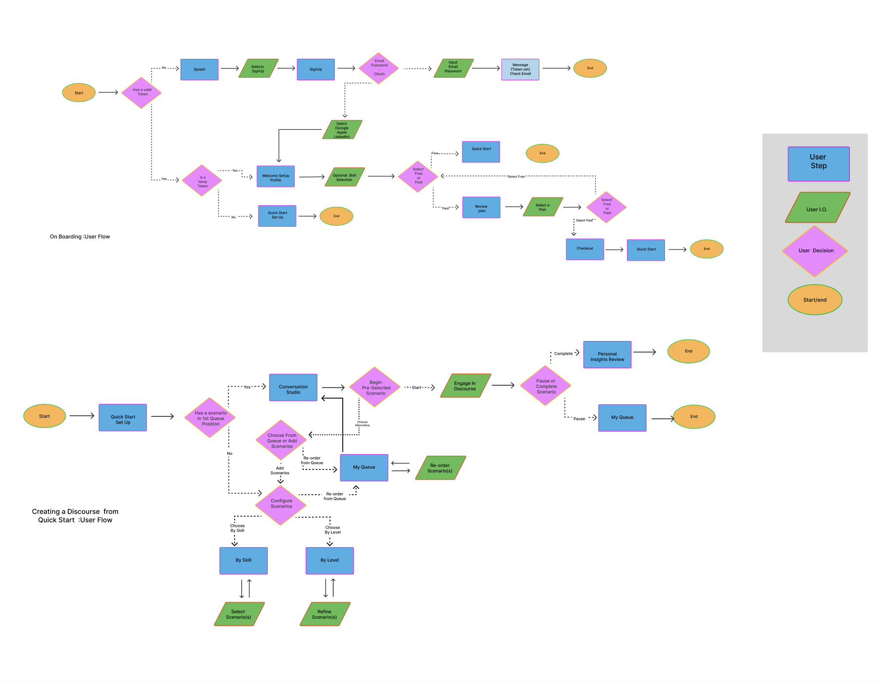
The live voice pipeline, built on LiveKit, is architecturally in progress and not yet demoable. The current prototype simulates the conversation; the pipeline is what makes it real.
Everything around this panel is TMS’s own system: warm paper, blueprint linework, rounded display type. The panel below is not. It is Discourser’s visual identity, Ink & Parchment, rendered in its own materials. The contrast is deliberate, and worth seeing rather than smoothing over.
Ink & Parchment positions Discourser.ai as a scholarly learning tool for serious, self-directed learners rather than a gamified app. Georgia serif brings editorial gravitas and Inter carries modern legibility: traditional wisdom, contemporary delivery. Warm stone neutrals reduce eye strain compared to stark whites. Lavender is the primary accent, sophisticated rather than playful, with chartreuse reserved for growth moments. The quotation-mark logo stands for Socratic dialogue, working as both wordmark element and standalone icon.
Georgia and the parchment ground create immediate credibility. Someone leaving one career for another needs the platform to look professional enough to mention in a job interview: serious professional development, not an online course.
The accent system and clear component hierarchy respect limited time. Chartreuse for primary actions, lavender for selected states, mineral gray for secondary options: scan and act, without studying the interface.
Warm stone instead of stark white reduces visual fatigue. A single-accent system lowers cognitive load, and the muted palette feels calmer than typical bright app interfaces, which matters for ADHD users in extended practice sessions.
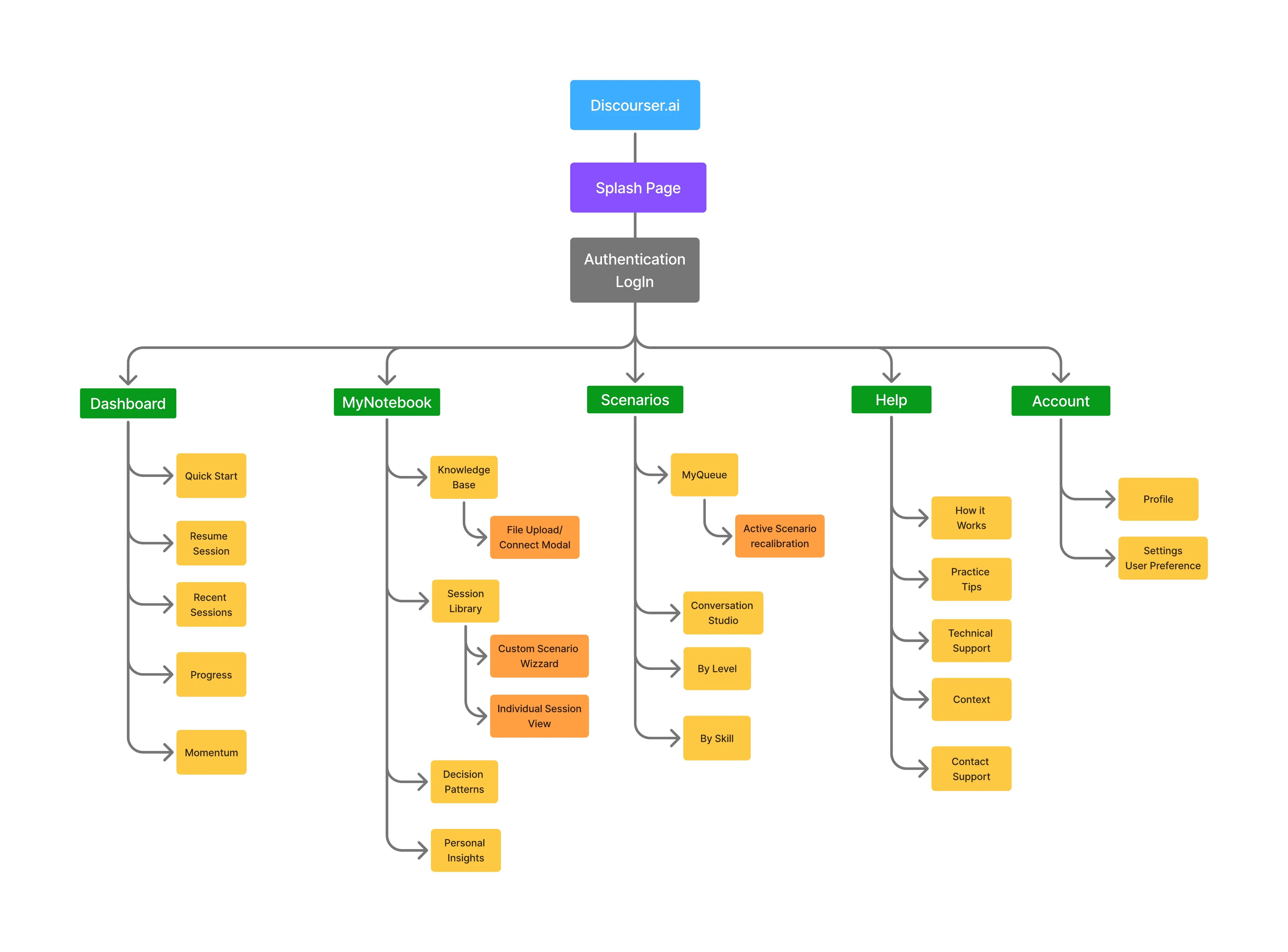
The card sort and MoSCoW data validate information architecture and scope decisions. They say nothing about the voice-confidence thesis, and this page doesn’t claim otherwise.
The ask coming in wasn’t just for an MVP. The client had a notion, not yet a thesis, that an application could build real confidence in knowledge someone had just learned, something that worked past where most online learning stops: the reading, the test, the presentation. AI looked like the right tool for that job, but what job to give it wasn’t clear yet. We pushed for discovery first, because a notion like that needs shape before it needs code.
A static, Figma-based simulation of the AI interlocutor got people to lean in. They understood the idea fast, and they wanted it. That’s real signal, and it isn’t the same signal as proof: interest tells you the concept lands, not whether an actual spoken exchange with an AI builds the confidence this product promises.
Discovery told us the idea was worth building. But only a prototype will tell us it’s worth trusting.